
Presentation Proposal (two ideas)
Use a dark background or take a picture of a carpet and add as a layer on Photoshop. would ask/ work with a make-up artist to create a pale and young face.have some hair accessories that I could use and perhaps get some leaves to add in the hair.For the boarder I could either find an image on google or find a photo frame. I could even ask my brother if I could borrow some of his wood and great a varnish effect. For the frills on the arms and neck I could gather some white material which I have at home.I could wear some small silver earrings for earring and a red beaded bracelet.
I would
wear a white long sleeve top and a purple dress that is short sleeves, so you
would see the white sleeves on the arms. To get the gold detail on the dress I
could experiment on Photoshop or cut some shapes out of gold card and pin on my
dress.
 Idea 2 =Portrait of Giovanni Arnolfini and wife
Jan van Eyck - Painted 1434
Early Renaissance Art Mixed with The Legend of Zelda.
- For this I have a make-up team to help me create the sinister look of the face of the man and the sweet pixie of the lady.
- For this I have a make-up team to help me create the sinister look of the face of the man and the sweet pixie of the lady.
- I would wear a purple dress. It would be a ballgown dress for the long drapery effect. I have a flower head piece to create the light elegant effect.For the man my friend has said she would take his place as she has a black hat and long black coat.She would wear a purple top and a mid length creased brown skirt underneath the coat.
-For the light effect I am going to have the light come in at an angle from the left. I will be taking my picture in the studio downtairs and then place my drawing in as the background on photoshop.
-For the background I will use soft pastels to create an interpretation of the bedroom . Unfortunately I could not read the writing so I did my own version of the date and put my name on in .
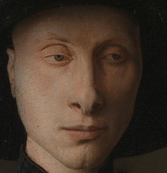
Close up of the mans face.
I am going to take idea 2 forward because I feel it would be more challenging and I would have a more sophisticated outcome as there is more detail and interesting aspects. such as colours, angles body positions and there is a more complexed background.
Head piece - Claire's £5.00
Models
Claire Edmundson - elf lady
Milly Reeves - Man
Scene - down stairs in the studio, so I can use the lightening facility.
The photos
These were my photos that I used to create my final outcome. I was experimenting with light and body positions to try and get the best results I could.


Photoshop
1. Firstly I chose the best images then I opened three layers and used ctrl v to paste them in. Before I could do anything I had to get rid of the padlock on the background photo so I could make changes.
2. I used the levels tool to change the colour to try and match the original image of the people.
3. I used the quick selection tool and magnetic lasso to cut out my people and get rid of any excess. While I was doing this I also used the refine edge button (select - refine edge) to clean up the outline. I then used the clone tool to add pieces in that it cut out by accident like hair as this is thin selections.
4. When it got to editing myself (the lady) due to the similar tone I had to change the tolerance when I got round to the dress and the grey background. After that I had to use the magnetic lasso and carefully make sure all of my body was in. During this I used the zoom in (ctrl =) and zoom out tool(ctrl -).
5. To make my self look pregnant I was going to use a cushion but because my dress is tightly fitted I used the liquefy tool on Photoshop. (Filters - Distort - Liquefy)
6.When placing my people in to position I was finding the background too small so I used the clone tool to make it bigger and made the canvas bigger.
7. I also made my arm shorter to make the hand position work. To do this I used the quick selection to cut part of my arm off. Then I used the free select tool + shift ( to keep the aspect ratio) to place my hand back in place.
8. I used the the spot human brush to fill in the man's coat and the clone tool to get rid of the t-shirt as I decided i didn't want it to be seen.
8.Finally I used the merged layers to combined the 3 images together because I found that having them as separate layers made the image look separated.
9. I altered the colour saturation and because the photos were one it changed everything.
Issues I had
During the process of 'cleaning up' my photos and merging them into one outcome I was finding that because my background drawing was a drawing and the people were photographs the people looked very sharp and out of place. I then took a experimental approach and used some of the artistic effects and filters to alter my photo.
The experimental photos
 Normal.
This picture there is limited filters. I felt that the people look to sharp and it doesn't look natural.I like this because the colours are strong.

Canvas with white border
Personally on Photoshop I felt this simple white border finished the picture of and gave it a finished look.

Antique effect with canvas and border.
I liked this black and white effect because I think it makes the photo old looking so is suitable for when the picture was set in the renaissance times.

Final photo with limited filters
Canvas
I added this canvas filter and i felt it bleneded in perfectly because it softened the people and created an painting look which the original looks more like.
Over the holidays I am going to prepare my background and collect any necessary materials or object needed.
Shopping list Head piece - Claire's £5.00
Models
Claire Edmundson - elf lady
Milly Reeves - Man
Scene - down stairs in the studio, so I can use the lightening facility.
The photos
These were my photos that I used to create my final outcome. I was experimenting with light and body positions to try and get the best results I could.
Photoshop
1. Firstly I chose the best images then I opened three layers and used ctrl v to paste them in. Before I could do anything I had to get rid of the padlock on the background photo so I could make changes.
2. I used the levels tool to change the colour to try and match the original image of the people.
3. I used the quick selection tool and magnetic lasso to cut out my people and get rid of any excess. While I was doing this I also used the refine edge button (select - refine edge) to clean up the outline. I then used the clone tool to add pieces in that it cut out by accident like hair as this is thin selections.
4. When it got to editing myself (the lady) due to the similar tone I had to change the tolerance when I got round to the dress and the grey background. After that I had to use the magnetic lasso and carefully make sure all of my body was in. During this I used the zoom in (ctrl =) and zoom out tool(ctrl -).
5. To make my self look pregnant I was going to use a cushion but because my dress is tightly fitted I used the liquefy tool on Photoshop. (Filters - Distort - Liquefy)
6.When placing my people in to position I was finding the background too small so I used the clone tool to make it bigger and made the canvas bigger.
7. I also made my arm shorter to make the hand position work. To do this I used the quick selection to cut part of my arm off. Then I used the free select tool + shift ( to keep the aspect ratio) to place my hand back in place.
8. I used the the spot human brush to fill in the man's coat and the clone tool to get rid of the t-shirt as I decided i didn't want it to be seen.
8.Finally I used the merged layers to combined the 3 images together because I found that having them as separate layers made the image look separated.
9. I altered the colour saturation and because the photos were one it changed everything.
Issues I had
During the process of 'cleaning up' my photos and merging them into one outcome I was finding that because my background drawing was a drawing and the people were photographs the people looked very sharp and out of place. I then took a experimental approach and used some of the artistic effects and filters to alter my photo.
The experimental photos
This picture there is limited filters. I felt that the people look to sharp and it doesn't look natural.I like this because the colours are strong.
Canvas with white border
Personally on Photoshop I felt this simple white border finished the picture of and gave it a finished look.
Antique effect with canvas and border.
I liked this black and white effect because I think it makes the photo old looking so is suitable for when the picture was set in the renaissance times.
Final photo with limited filters
Canvas
I added this canvas filter and i felt it bleneded in perfectly because it softened the people and created an painting look which the original looks more like.
Evaluation
Overall I am very pleased with my outcome considering the whole photoshoot has been an new experience. I fell that my outcome reflect the effort I have put in because I have thought about different aspects such as lighting, background and angles and not just used a phone to do a quick snap. Also from a fashion point of view I tried to included the ruffles/layers in the dress which were the style long dress were painted in the renaissance time. I think my background worked extremely well because I focused on shade and light. The colours work well compared to the original image because there is a large empathise on the blending in of the soft pastels. When editing on photoshop I was finding it difficult to have my people in similar positions due to the arms being long, so I had to edit them. Personally I like the bold colours and i think they do work well however becuase the background is a drawing and the people are photographs it does stand out massively. If I was to do this again I would plan my time better. Ideally I would have liked the make up students to create the sinister face of the man and even have created the elf ears. We were given the opportunity but I never properly arranged it.Furthermore If I was given the change to do it again I would try and get the people and the background all in one shoot. This again was due to planning and time, if I did have just the one shot it would have made editing easier because everything would all be in place. I could have also focussed on more minor detail such as the hair and hand positioning if I had one photo.
No comments:
Post a Comment