Sunday 21 December 2014

Surrealism research

                                                        Renne Magritte

Renne Magritte is surrealist artist who was born in Belgium 1 November 1898.
He liked to challenge viewers perspective and their true idea of reality. He was particularly well known for his use of juxtaposition of familiar everyday object and his witty outcomes 

websites used -http://5factsabout.com/articles/5-facts-about-Rene-Magritte/ , 5 facst about, 2013
http://www.biography.com/people/ren%C3%A9-magritte-9395363, BIO. 2014

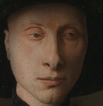
The Son of Man, Rene Magritte  1964 


Rene Magritte  idea behind this photograph is stating that not seeing can sometimes be better than seeing. Once we have seen our minds will never forget. He quotes "“Everything we see hides another thing."  This inspires me because it suggest that our eyes will lead us to the future as well as the present. I also like the idea it gives with him peeking over the apple because it gives me the representation of being noisy and seeing what not meant for our eyes. 

Websites used -http://all-that-is-interesting.com/most-iconic-surrealist-paintings/2, All that is interesting by By on January 22, 2012  
http://www.renemagritte.org/the-son-of-man.jsp, Rene MagritteBiography, Paintings, and Quotes, 
2009. 

  The false mirror, Rene Magritte, 1928
 
When I look at this image I  ask some questions, is the sky being reflected? Or is the sky part of the eye? Is the world represented as the sky?I like the use of surrealism in this photo because it works really well. There are certain characteristics that makes this so effective and dynamic so it works very well and naturally. For example there is both horizontal and vertical symmetry in colour and shape. The fact that the pupil is right in the centre gives a bold result, drawing your eyes into it . Also there is such a contrast from the solid colour to the gentle outline of the eye that gives me the feel that the sky is acting behind the centre pupil. 

Giaconda 1953

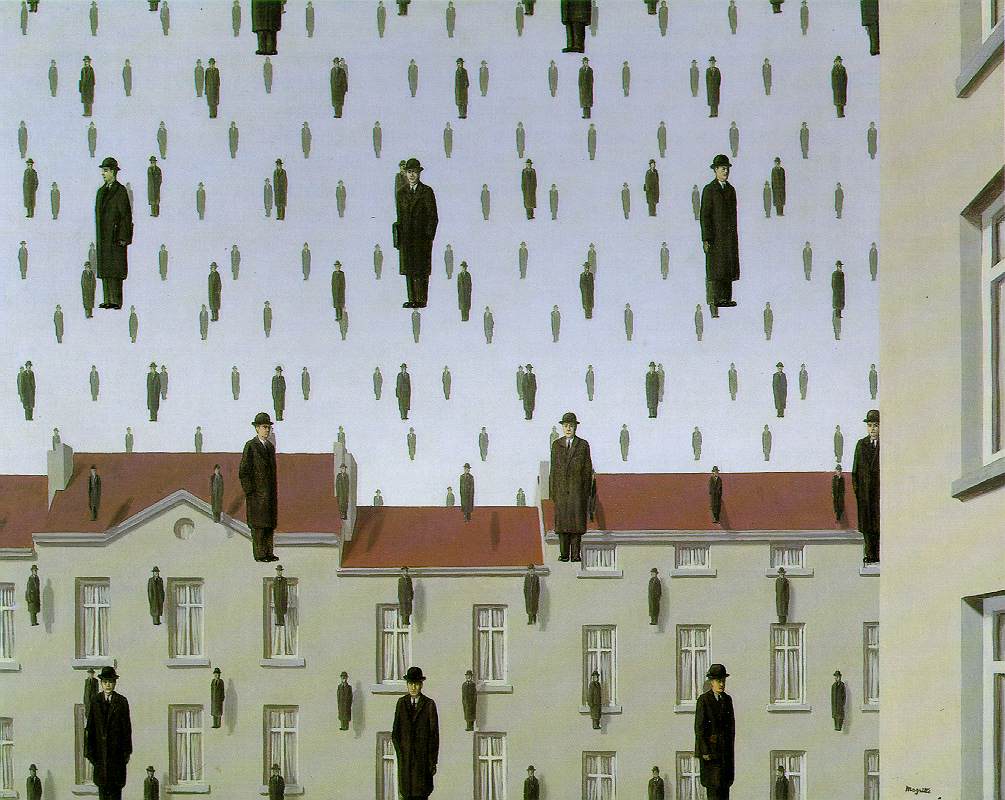
 I love the idea how he has used the people as the rain. One technique that has been used in this photo is duplication, however this has been used carefully because the duplication is not exact which makes it look more realistic along with the use of perspective creating an illusion. 

Website used-http://www.mattesonart.com/1949-1960-mature-period.aspx, Matteson Art, 2014

Salvador Dali 

Salvador Dali is known for his shockingly impressive imagination and his outcome of surrealism. He was born in Spain, 1904. It was only in 1939 that he became familiar with the surrealism art movement.Much of his work is displayed in the Salvador Dali museum, Florida. Originally the surrealist group did not include painters in their group. They met in cafes and discuss ideas such as psychology and social revolution. Later visual arts became the key aspect of surrealism and with Salvador Dali being such a genius and skilful at his paintings he became a foreground figure to the group.

Websites used-http://thedali.org/about-dali/about-dali/, Salvador Dali Museum, 2014
http://www.socialphy.com/posts/art/20590/Salvador-dali_-works-and-biography.html, Salvador dali, works and biography

Elephants wallpaper Salvador Dal
 
I think that Salvador Dali juxtaposition of the trumpets and elephants is a great idea because you can link the trumpet noise as the noise anelephant makes. Also the shaping of  the trumpet works as a good replacement, the end of the trumpet associates as the trunk and the round middle with all the piping as the head with features.  

Salvador and the ship, 1943
   
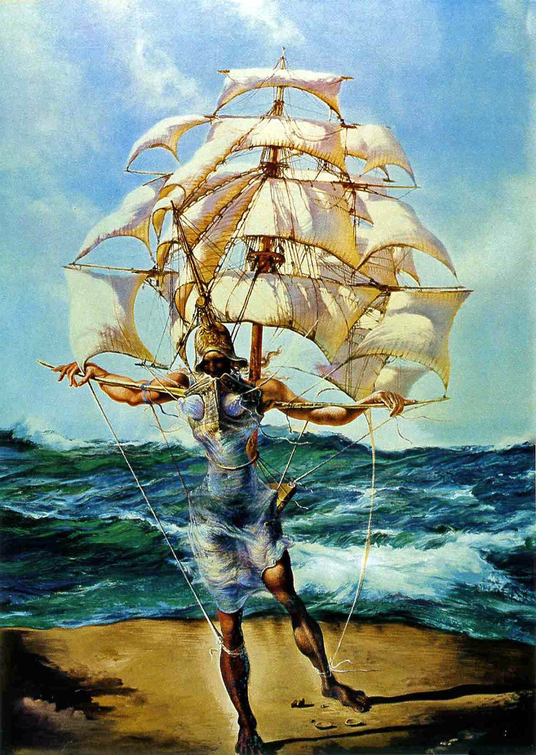
When I look at this image. I see that the man is pulling the boat along. This has been cleverly done because the man looks like he half striding though the water and half on dry land. This image creates a mythical feel because of the 'human' is disfigured letting us create what we want in its place in terms of facial features. This image has used a technique called Paranoiac-Critical which was developed by Salvador Dali. It is the idea od seeing illusions in siumple objects. For example seeing the inside of the figures body in the waves but as clothes. 

Websites used- http://aminotes.tumblr.com/post/437734981/salvador-dali-the-ship-1943-the-ship-is
http://www.languageisavirus.com/articles/articles.php?,msubaction=showcomments&id=1099110809&archive=&start_from=&ucat=#.VJW2ql4gA, Lapidarium notesn 

Butterfly Windmill, 1956
I think that butterflies as the propellers of these windmills are a fantastic creation. The butterflies could represent that they will only turn when they have the transformation of energy. They could also represent the movement of light fluttering of the wind making them turn. Or even the delicate job of the windmill.  

Julie Verhoevon  
Julie Verhoevon is a British fashion designer and is best known for her mischievous approach.  During her time she has designed limited-edition bags for Louis Vuitton and is now working on accessories for Mulberry. Her work has been successful in fashion catwalks from swim suits all the way to accessories, where some of her work is displayed at Institute of Contemporary Arts London. 

Websites used- http://www.culturewhisper.com/event/view/id/2651,Julie Verhoeven, Institute of Contemporary Arts 
http://www.independent.co.uk/property/house-and-home/my-home-into-the-world-of-fashion-designer-julie-verhoeven-396415.html,My Home: Into the world of fashion designer Julie Verhoeven, Interviewed by Tessa Williams on Wednesday 10 October 2007

Personally i love Julie Verhoeavon's creative style. I think this dress is full of surrealism of familiar object scattered all over. It creates an over dynamic effect as there is so much going ion in such a savage but whimsical. 
  
By the looks of it Julie Verhoeavons choices of fabric seem very simple, this could be so that lots of print and detail can be used. They could be made out of polycotton as this would be practical and cost effective because it is very comfortable and strong due to being woven.

                                  Close up of Bag   

 
The pattern on this handbag is quite cartoony and playful with what appears to be mythical creatures and kings and queens of importance.
Julie verhoevan pictures from-http://whereartmeetsfashion.wordpress.com/2012/09/28/collaboration-flashback-versace-julie-verhoeven/, Where art meets fashion,September 28 2012


The surrealism on this fashion illustration is how everything is out of proportion and place but it helps create a quirky finish. I think the limited colour pallete works well along with the fading of colour. Overall I think it is unusual with a cheeky edge to it.

Agatha Ruiz Dela Prada 

Agatha Ruiz Dela Prada is a Spanish hit for fashion; especially outrageous fashion!Agatha Ruiz de la Prada began her career in fashion in Madrid in 1981, with the presentation of her first collection in Local, a Design Centre.  Agatha Ruiz Dela Prada style is full of love, humor and optimism, with  extraordinary colours and forms as a basis for this world she has created.

Websites used-http://www.fashionmodeldirectory.com/designers/agatha-ruiz-de-la-prada/,The FMD 

2009 Winter collection 
 
I absolutely love this! The umbrella upside down is such a cheeky idea along with upside down skirt. So simple yet so creative. It works... I have nothing more to say its phenomenal!

The satin corresponding jacket makes this look sophisticated. I like the shiny rain drops in an icy blue because they look a realistic interpretation.

Fried Eggs. from her fall collection 2009
 Agatha Ruiz de la Prada
I think this is so unusual and different. I am going to be honest I thought I would see breakfast on a fashion out fit. I love the bold vivid table cloth design because it is traditional pattern and simple. I think this works well because there are only two eggs creating an unnatural approach but the baguette head band balances it out. I think the large structure of the skirt is fantastic, it almost looks like it is hanging over a table.

Piano Dress
 I think this example of surrealism is not too overthe top and abitous. I think the colour red has added flare to the dress. Personally I think any other colour would look wrong because a piano can be used to show love and dynamic which is also shown in red.  I love the musical inspiration in this dress being a flute player myself. 

Victor and Rolf 

Viktor & Rolf is an Amsterdam-based fashion house. The company was founded in 1993 by designers Viktor Horsting and Rolf Snoeren. 

Website used -http://en.wikipedia.org/wiki/Viktor_%26_Rolf

Spring/summer collection 2008
 
In my opinion I like the softy gentle approach to this dress with the calm subtle colour tones used.I like the structure of the folds in ther dress with the replicated swirl patterns often found on violins. I also like how ruffs have been used modernly with the delicate white rose at the neckline.  

Fashion week 2010
In this dress the wow factar has got to be the skirt. It's amazing because it is so unque. For me the surrealism behind this a block of cheese nibbled at.I like the cut away at the tulle. I think this dress looks fantastic because there is a huge contrast from 'normal'  and distinctive to create an elagnt outcome. 

Fall collection 2008 
3D in a coat? This is totally unbelievable because this is so powerful. The one plain colour and limited detail makes this look incrediable. The 3D caption blends in so well which is why it looks dynamic. I think the uncomplicated tie just finishes this off making it look classy.

Theme stairs and surrealism 
The Autumn Stair by Nguyen Dinh Dang.
 

For me this surrealistic picture looks like it is a represntive of Nguyen Dinh Dangs dream. The feeling I get is that  he is onn a beach curled up in bed upstairs with loud eery music a harsh wift wind as it looks like things are blowing about. The sky and colours look misty which gives me the idea that something bad might happend and wake him up.


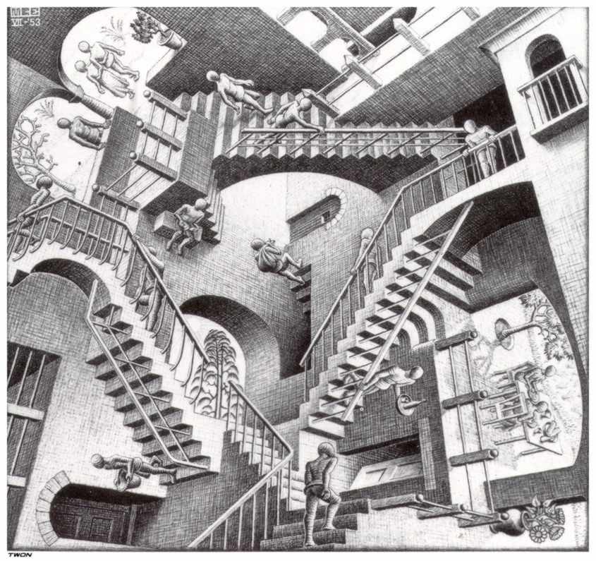
Escher is a famous artist who created mathematically challenging artwork. He used only simple drawing tools and the naked eye, but was able to create stunning mathematical pieces. By using black and white, he was able to create different dimensions to make the mathematically impossible seem possible. In this drawing, Escher creates a staircase that continues to ascend and descend, which is mathematically impossible, but the drawing makes it seem realistic.

These stair cases are really quite inspiring of how you can use something so simle and familar create something 'impossible'.What I particularly like is how you can look at the image on all four sides and it still works, especially with the ascending and desecnding effect.

Scene Under the Stairs - Jacek Yerka
 
In my opinion the idea behind this is that you go up the stairs to a world of imagination , let be what you want. The wooden floor blendss in with the shadow and outside so naturally.

Website used -http://www.wikiart.org/en/jacek-yerka/scene-under-the-stairs

Giuseppe Arcimboldo

Giuseppe Arcimboldo was an Italian painter best known for creating imaginative portrait heads made entirely of objects such as fruits, vegetables, flowers, fish, and books. 
The Admiral 
This is one of my favourite pieces of  Giuseppe Arcimboldo's work. Firstly I really like the blues and greens to create the silvery death look. What really  stuns me is how he is able to make each and every creature look so picture perfect in the right place. The snake headband looks so precise giving an edge to the mess hair. I like how the face even has tone to make it look so believable. I think the shells are so iconic her because it gives the idea of jewels and importance.


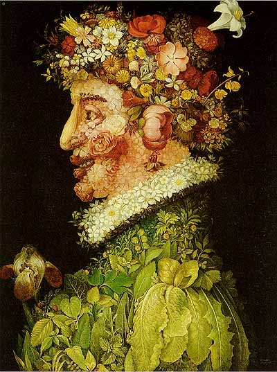
This is one of the four seasons; spring. It is made up of individual flowers and leaves. I notice one clever aspect of Giuseppe Arcimboldo is that his portraits are facing the side this could be so that he doesnt have to worry about symmetrical faces and can have more fun with shapes and outcomes. With this particular image I like the build up of the cabbage leaves to create the shoulder. I think it is very clever how he has uses size and layering to show perspective.

Wednesday 15 October 2014

Photoshoot Project

   
 Presentation Proposal (two ideas)
Idea 1- Rare Italian Renaissance Painting
 Use a dark background or take a picture of a carpet and add as a layer on Photoshop.  would ask/ work with a make-up artist to create a pale and young face.have some hair accessories that I could use and perhaps get some leaves to add in the hair.For the boarder I could either find an image on google or find a photo frame. I could even ask my brother if I could borrow some of his wood and great a varnish effect.  For the frills on the arms and neck I could gather some white material which I have at home.I could wear some small silver earrings for earring and a red beaded bracelet.
I would wear a white long sleeve top and a purple dress that is short sleeves, so you would see the white sleeves on the arms. To get the gold detail on the dress I could experiment on Photoshop or cut some shapes out of gold card and pin on my dress. 


Idea 2 =Portrait of Giovanni Arnolfini and wife
 Jan van Eyck - Painted 1434
Early Renaissance Art Mixed with The Legend of Zelda.
 - For this I have a make-up team to help me create the sinister look of the face of the man and the sweet pixie  of the lady.
    - I would wear a  purple dress.  It would be a ballgown dress for the long drapery effect. I have a flower head piece to  create the light elegant effect.For the man my friend has said she would take his place as she has a black hat and long black coat.She would wear a purple top and a mid length creased brown  skirt underneath the coat. 
    -For the light effect I am going to have the light come in at an angle from the left. I will be taking my picture in the studio downtairs and then place my drawing in as the background on photoshop.
-For the background I will use soft pastels to create an interpretation of the  bedroom . Unfortunately I could not read the writing so I did my own version of the date and put my name on in .

 Close up of the mans face. 

I am going to take idea 2 forward because I feel it would be more challenging and I would have a more sophisticated outcome as there is more detail and interesting aspects. such as colours, angles body positions and there is a more complexed background.

Over the holidays I am going to prepare my background and collect any necessary materials or object needed.
Shopping list 
Head piece - Claire's £5.00

Models 
Claire Edmundson - elf lady
Milly Reeves - Man

Scene - down stairs in the studio, so I can use the lightening facility.
The photos
These were my photos that I used to create my final outcome. I was experimenting with light and body positions to try and get the best results I could.


Photoshop
1. Firstly I chose the best images then I opened three layers and used ctrl v to paste them in.  Before I could do anything I had to get rid of the padlock on the background photo so I could make changes.
2. I used the levels tool to change the colour to try and match the original image of the people.
3. I used the quick selection tool  and magnetic lasso to cut out my people and get rid of any excess.  While I was doing this I also used the refine  edge button (select - refine edge) to clean up the outline. I then used the clone tool to add pieces in that it cut out by accident like hair as this is thin selections.
4. When it got to editing myself (the lady) due to the similar tone I had to change the tolerance when I got round to the dress and the grey background. After that I had to use the magnetic lasso and carefully make sure all of my body was in. During this I used the zoom in (ctrl =) and zoom out tool(ctrl -). 
5. To make my self look pregnant I was going to use a cushion but because my  dress is tightly fitted I used the liquefy tool on Photoshop. (Filters - Distort - Liquefy) 
6.When placing my people in to position I was finding the background too small so I used the clone tool to make it bigger and made the canvas bigger.
7. I also made my arm shorter to make the hand position work. To do this I used the quick selection to cut part of my arm off. Then I used the free select tool + shift ( to keep the aspect ratio) to place my hand back in place.
8. I used the the spot human brush to fill in the man's coat and the clone tool to get rid of the t-shirt as I decided i didn't want it to be seen.
8.Finally I used the merged layers to combined the 3 images together because I found that having them as separate layers made the image look separated.
9. I altered the colour saturation and because the photos were one it changed everything.

Issues I had
During the process of 'cleaning up' my photos and merging them into one outcome I was finding that because my background drawing was a drawing and the people were photographs the people looked very sharp and out of place. I then took a experimental approach and used some of the artistic effects and filters to alter my photo.

The experimental photos 

Normal. 
This picture there is limited filters. I felt that the people look to sharp and it doesn't look natural.I like this because the colours are strong.


Canvas with white border 
Personally on Photoshop I felt this simple white border finished the picture of and gave it a finished look.


Antique effect with canvas and border.
I liked this black and white effect because I think it makes the photo old looking so is suitable for when the picture was set in the renaissance times.


Final photo with limited filters


Canvas
I added this canvas filter and i felt it bleneded in perfectly because it softened the people and created an painting look which the original looks more like.


Evaluation 
Overall I am very pleased with my outcome considering the whole photoshoot has been an new experience. I fell that my outcome reflect the effort I have put in because I have thought about different aspects such as lighting, background and angles and not just used a phone to do a quick snap. Also from a fashion point of view I tried to included the ruffles/layers in the dress which were the style long dress were painted in the renaissance time. I think my background worked extremely well because I focused on shade and light. The colours work well compared to the original image because there is a large empathise on the blending in of the soft pastels. When editing on photoshop I was finding it difficult to have my people in similar positions due to the arms being long, so I had to edit them. Personally I like the bold colours and i think they do work well however becuase the background is a drawing and the people are photographs it does stand out massively. If I was to do this again I would plan my time better. Ideally I would have liked the make up students to create the sinister face of the man and even have created the elf  ears. We were given the opportunity but I never properly arranged it.Furthermore If I was given the change to do it again I would try and get the people and the background all in one shoot. This again was due to planning and time, if I did have just the one shot it would have made editing easier because everything would all be in place. I could have also focussed on more minor detail such as the hair and hand positioning if I had one photo.

Friday 3 October 2014

Fashion Photographers Research


Nick Knight
Born 1958
Studied at Bournemouth and Poole college of art and design. Graduated with a distinction in 1982

He is among the world’s most influential and visionary  photographers.  He likes to challenge ideas and is known for his ground-breaking creative ideas. He He has been involved with leading fashion designers such as Alexander McQueen, John Galliano and Yohji Yamamoto. Also he has helped clients advertised such as Swaroski and Levi Strauss.  
He first published his own book of photographs in 1982. He has also published  Nicknight, which is  a twelve year retrospective,  series of flower pictures, they were published by Schirmer Mosel. He has worked on a range of often controversial issues during his career - from racism, disability, ageism, and more recently fat-ism. He continually challenges conventional ideals of beauty. night's work has been exhibited at Saatchi Gallery, the Photographers Gallery and Hayward Gallery.  

I like how Nick Knight uses plain backgrounds to emapthise the dynamic poses. I like the middle picture paticularly because she has an emotional body position that makes us want to help her. I think the colour blue help represent her sadden mood.

Websites used : http://showstudio.com/contributor/nick_knight
http://www.vogue.co.uk/spy/biographies/nick-knight-biography


Mario Testino
Born 1954 in Peru 
studied economics at college


He has shot numerous magazine covers for high-profile magazines like Vogue and Vanity Fair. He likes to shoot the very best of the best in terms of models –Naomi Campbell, Kate Moss, , Lady Gaga, Rihanna, Britney Spears ect. He is popular with the royal family so when they decided to be profiled in a luxury publication, there he is. He shot Princess Diana for Vanity Fair magazine in 1997, and he has photographed the Duke and Duchess of Cambridge Prince Harry and Kate Middleton. He came to London in 1976, took a flat in an abandoned hospital near Trafalgar Square, and began selling portfolios.  He is well know for his polished and exotically bright campaigns and exquisitely styled photographs. 

I really like the angles and body positions of Mario Testino shoots. I think there is a high focus on the face. I get this impression because of the lighting and intense make and hair. When I take my photo I am hoping to create the shadow effect and empathise on the face.  I am going to also think about angles and body positions of my people what ever picture I do. Proportionally I am going to use sizing to strengthen the focus on the lady of the Arnofini wedding or just like the heads are bigger on these picture.

Websites used:http://www.therichest.com/expensive-lifestyle/fashion/top-10-photographers-in-the-fashion-industry/ 
http://models.com/people/mario-testino 

Timothy  Walker
Born 1970
studied -Walker’s interest in photography began  London (Condé Nast libary).he worked on the Cecil Beaton archive for a year before university.After a three-year BA Honors degree in Photography at Exeter College of Art, Walker was awarded third prize as The Independent Young Photographer Of The Year.  Graduated at university in 1994. 
Timothy walker has grabbed readers attention in the view magazines month by month with his extravagant staging and romantic motifs characterize his unmistakable style. Walker worked as a freelance photographic(takes photos to make money) assistant in London. Later he moved to New York City and became a full time assistant to Richard Avedon. When he moved back ton England, he  concentrated on portrait and documentary work for British newspapers.  At the age of 25 he shot his first fashion story for Vogue, since then he has photographed for the British, Italian, and American editions, as well as W Magazine and LOVE Magazine. 

Website used-http://timwalkerphotography.com/biography


I love how Timothey Walker uses such delicate and detailed backgrounds to create a scene and create an atmosphere. I also Like how all of these shoots have the same sift floral aspect to them, this suggests he has a consistency. The lady on the left has a carefully considered facial expression. I am going to take this on board when I take my photo. To create this I am sure that Timothy Walker tried various facial shoots before settling for his final outcome so I am going to carry this out. Also I admire the carefully angled hand positioning. On the Arnofini painting there is a inspirational hand positioning between the man and women to show there love so I going to particularly focus on this as it is centre of attention, being in the centre of the page and creating that real love and affection feel.

Annie Leibovitz 

Born Connecticut 1949
Studied she studied photography at the San Francisco Art Institute, here,  (at 19) she took a photograph of Allen Ginsberg smoking a joint on an anti-Vietnam march.  

Annie Leibovitz is a sensentinal photographer and some people even believe she has created some of the most beautiful portraits that have ever been captured on the printed page. She has done some close work with the Rolling Stones including  photographing John Lennon and Yoko Ono for the magazine’s cover (while she was still a student). Annie Leibovitz work is ubiquitous(most popularly found in the vogue and vanity fair) it includes the pregnant shoot of Demi Moore and unforgettable ones of Lady Gaga. In her career she has also shooted for  President Barack Obama and the first family at the White House.  However she is back to the camera for her latest shoot featuring Kanye West and Kim Kardashian in the vogue maganzine with their new baby. Leibovitz style is perfectly tailored to celebrity-fuelled times.
Websites used: http://www.therichest.com/expensive-lifestyle/fashion/top-10-photographers-in-the-fashion-industry/10/
http://artsinstitute.stanford.edu/events/fashion-at-stanford-annie-leibovitz-pascal-dangin/ 
http://www.theguardian.com/artanddesign/2006/oct/22/photography 

Anne Leibovitz photographs consists of ladies in big dresses, including acsented drapery this is similar to the Arnolfini wedding. I like how Annie Leibovitz uses light to make the faces stand out which is also a feature in both my planning ideas.