Wednesday, 14 January 2015

Photoshop planning,experimentations, tools and results


My Dream Diary 
This is my dream diary that was just a starting point for ideas for my surreal outcome. I produced this with ideas about typical dreams and combining aspects of my research, which I found inspiring.

Becha's Work
  
For this project I opened up the link found on Blackboard, which took me to Becha's blog. Here is a step by step guide of how to create a surreal finish, like Becha's work.
Method 
1) To start with I had to open Photoshop and set the canvas size to - width 222 mm, Height 300 mm, Resolution to 300 pixels/inch. I didn't need to worry about the background colour because the next step I added texture. 
   2) I then went to the downloaded file and copied the texture on to Photoshop by dragging it. To change the colour of this I had to use a new tool called invert (ctrl i). This turned it blue which is the opposite colour in the colour wheel.


3) To add a ground I selected another new tool called the Elliptical Marquee tool (shift m) I used this to create a oval, which I then went to Image>Adjustments> Colour Balance. this allowed me to change the colour to a reddish hue as the red is ore dominant with the settings: +100, -13, -12.
4) I now used the level tool (ctrl l) to create a bigger contrast from the 'sky' to the 'ground.'
 
5) I copied drawing 1 from the downloaded file and copy it into Photoshop as a new layer (ctrl n). Using the magic wand tool (w) I selected the white area I dint want. I used the free transform tool to make the drawing smaller and place it in the middle. To make the drawing stay proportional I also used the shift key. I also used the magic wand (w)to add colour as well as the eye drop tool (i)to select a colour I had already used. I was experimenting with pattern and finding new tools that worked and didn't work. 

6) I used added some new layers and added and added some drawing found on the downloaded file which I added colour using the magic wand tool (w). To select multiple selections I used the shift key.Once these were done I copied (ctrl c) and pasted (ctrl v)them on to my first drawing and changed the size and angle using the free transform.


7) Final outcome! 
I found this fairly simple dispite having some difficulties at first but once I got into the flow of things I became more confident.  I am happy with my overall outcome,  however to improve I think it would be good to add some 3D text and make it look like it has texture. During this project I used the zoom in (ctrl -) and out (ctrl +)tool as well as selecting the right layers which was the trickiest part. Also I think if i used a mask to start with and opened a new layer to add colour so I wasn't colouring the drawing it would make my results look more clean. I will bare this in mind and have a go at this for my next drawing to develop my Photoshop skills. Also I will have a go at using the brush tool (b) to add colour because this way I can add tone.


My next task was developing my skills when adding colour for this I used two resources:
Drawing Basics and Video Game Art by Chris Solarski
A video link which guides my through how to create a mask. This was a different way of learning and was very useful.. I learnt a technique of suing colour swatches for later uses and the benefits of the eye drop tool.
Mask
 To make a mask you must make sure you object is connected, if not use the brush tool (black) to connect the lines. Use the magic wand tool to select the image and add a new layer  (shift n). On the new layer colour this in black . Now to colour your drawing in select parts using the magic wand and open new layers (shift n). This way you will be adding colour behind but because of the mask the colour can not go outside so the quality is much better.
My proposal 
I am going to base my ideas and outcomes on  sea. I am hoping to come up with different ideas of surreal dreams all completley different. I am going to incorporate naturae and animals, this will link to Giuseppe Arcimboldo's work  in to my reserach as I may try style of art . I also like Eshers's work with the stairs so I am going to seeif this works well. I would like to experiment with typography but I shall see whether this is successful or not.
Based on my skills that I now have I tried to create an surreal outcome. This is just a starting point which is why I have used images and not my own drawings. 

                                                                                                                                                                                                                                                                                                                                                                                                                                                                                                                                                                                                                                                                                                                                                                                                                             1) I found this image on https://elisefaye.wordpress.com/category/line-drawings/ and copied it on to paint. Here I rubbed out the figure on the right and saved this as an JPEG image in case I need it for later reference.

2) I opened up Photoshop and copied the figure in . Using the magic wand (w) I removed the white excess. I also used the magic wand (w) to select multiple (shift) areas to add colour. To improve this I later learnt about creating a mask to produce a cleaner outcome which I will have ago at later.
3) Next Ifound to make this creative work surreal I used seaweed found onhttp://imgarcade.com/1/kelp-seaweed-cartoon/ for hair. This included using rotation, sizing (ctrl t) and the marque tool (m) to place each stand so is looks natural. To fill the hair I used the pattern fill.


 4) Looking at my research I was inspired by the umbrella outfit so I found this umbrella (http://www.completefg.com/good-student-discount-details.php ) and copied (ctrl c)it on to Photoshop placing this layer on top on the figure for her skirt. I had to position this so it looks natural, relating to the figure being turned to the right. I copied (ctrl c)a dolphin (https://www.google.co.uk/search?q=dolphin) and put this in front the umbrella as a sun. I used orange instead of blue because it wasn’t visible and relates to being a sun. I also filled a fish (http://www.bestcoloringpagesforkids.com/fish-coloring-pages.html) and placed it as belt filling it with the magic wand (w) and fill bucket. For her eye to relate to the sea/ water theme I used a shell and I thought the mouth of a shark (https://www.google.co.uk/search?q=shark+mouth+drawing)  could represent a hood. 
6) For a contrast I used a bend ended flute as the handle, of the umbrella using the eraser to demolish the original.

7) To finish I opened a new layer and added a background using the gradient tool (g) to make it strong and dynamic.
To improve this I would use more music elements to make the surreal look stronger. Perhaps I could have used a trumpet for the hood instead of a shark and a treble clef tilted on its side for her eye. After adding the gradient background I asked my class mate her opinion as it did look a too strong and she suggested using a background that reflects the hood. I think this outcome has strong quality with elements that work together well. The colours are solid with good definition images. Also the colours I added are clean and precise edges after I joined any gaps up to start with. I also added some crabs that blend in with the new background which create her shoes.
Final outcome 1
Outcome 2

 My next outcome I feel I have a more complexed idea but the quality is not as strong as my previous outcome. To improve the quality I believe I should have started with a larger image with more pixels; to do this I would use the advance search tool on goggle.  Looking at my research I found that artists quite often use animals to create the surreal effect. The inspiration for this came from my dream diary of animals and creatures behaving mischievously  in dreams and doing peculiar things. While I was creating this piece  also came across another surreal artist called Giuseppe Arcimboldo, who I found very inspiring and started to make close links to my own work.I tried using his style on the hair which i felt quite well because the animals and shells work as stands and the hair looks big and bold.

 I feel this is an improvement from my first outcome because I have used my own drawings and devices like then light box. I hand drew the figure and used the light box to trace the fairy. I then used water colour pencils to colour in the fairy because when I did it on Photoshop I felt the colours were too solid and daunting for a light fluttering fairy.  I also used some glitter to add a magical touch to the wings. 

For the skirt I think Iwas trying to be over  ambitious. I wanted the snake the wrap around like a skirt but also come out the water to make it look like a a sea monster. Obviously there was not one image that was going to work so I had to manipulate an image to make it look natural. I feel that the first time I did this I used such a small image that it became so pixualated and looked terrible. I deleted these layers and tried going for a large image and the quality of skirt is so much crisper and clear. I didn't want to ruin the neat finish so I didn't try to make it come out the water.

The story behind this outcome is very surreal. Firstly you got a dainty magical fairy gently drifting on a flower in a storm. There is also the bright colours on the bra on a miserable night. I used the musical notes in a circle to represent a sun to the dampen dark night . I felt music notes would be perfect because sometime music can completely change a image or experience, therefore I feel it is so powerful; just like the heat of the sun. Some of the sea creatures are upside down while  all looking hopeful at the water. The ice-creams as the shoes completely finish of this surreal outcome because they are usually a must have in the summer not on a dark night winter storm. 


 Looking back at this I would go back and alter the levels again to make it slightly darker background because I think I have got it slightly too light. Also I would start with a larger image to get a stronger outcome. I feel that I could also edit her skin because I would like to go a tone or two darker and be more precise by perhaps using more variety of brush sizes or a mask. One of the strong elements about this piece is the amount of surreal going on I think it all combines to create a dream/story.


Outcome 3   
 This is my starting drawing


Looking at this outcome I think this is my best. The images I used for the background is so much clearer. I like how they blood sea creates the sinister look with the nightmare expression of the face, linking the theme to my dream diary. We have all had those spooky nightmares where we wake up screaming! I think the black and red colour scheme works well because it can represent blood and death as black is worn at  funerals and crows can be associated with death. I think he blue and pink add a real contrast. The surreal idea with the knife is that it is stuck in the sand like a grave, with the fresh blood oozing around the dead body. I think the beach with blood sea is a good contrasting idea because a beach can be associated with happy memories, whereas blood can be death or fear.  The wrap around door blends in well with her space themed hair. You never know what is behind the door and life is so unexpected.

When looking at my my design I decided it needed some depth and perspective because it looked very flat. For this I first of all tried making the blood see curved as sea doesn't just stop flat, I also tried using the 3-D tool I found but this didn't really work so I went back to using what I know.  I found a different image for the background which had a horizon on so it looks like it is in the distance. I particularly like this image because I like how the sea gradually get lighter, so it doesn't just stop.

 1)  Once I pasted the  new background and deleted the blood sea,I felt I had so many layers it was hard to work with so I grouped  all of the person images together and called it man. I also grouped the crow, sword and blood together.

2) Next I use the clone tool (s) and (alt) try and make the sand blend in together. I was finding that there was part of the foreground sand that looked unnatural so I changed the sample I had taken and changed the levels and added a hue/saturation to the sand.


3) The sea was a lovely crystal blue, I try creating a mask over the sea and just changing the colour balance to make the sea red so the red was more doniment. My next idea was to use the clone tool of red with a low opacity and brush over the sea. I did this but it then made the sea just stop at This wasn't creating the blood sea that I had in mind so I decided  to have an overly balanced sea that was quite dark to create the surreal outcome. To do this I added to hue/saturations to this layer.


4)  To add the red tinted sea, hence the blood effect I again added a mask to the horizon and used the brush tool with a low opacity with red colour.I used a fairly thick brush diameter.
 
5) Looking at the positioning of the sword I felt it could have more of a purpose, therefore i have added a shark, which fits nicely to the theme I have going on on my overall outcomes. To add this I used the magic wand. I them used ctrl t to tilt the shark at a angle. Looking at the shark I felt it looked out of place so I changed the curves. Next I used the clone tool again to add the extra length it need as I didn't want to stretch the image. I then just moved the sword, blood and crow. To clean up the image I rubbed out some of the extra blood droplets.


6) This is my final outcome but I feel that it could do with some texture so I am going to experiment with the different artistic filters and see which ones are appropriate.


5) Finally to pick up the texture of the sand I used a filter over the whole image.


Evaluation of entire project 
Overall I think this project has gone exceptionally well. I have approached it with dedication and as a result I have 3 impressive outcomes considering I have only been building on my skills I already know. I think that Photoshop is a great program for experimentation because you can just delete your history or remove/edit different layers.

I think the research was a good starting point because I didn't really know where ton start when we were given the task 'surreal fashion.' I was particularity intrigued in Esther's work although it was not fashion linked. I wasn't that found of Julie Verhoevon's work because I didn't find it fascinating or have a wow factor about it. This is a complete contrast to what I thought of Agatha Ruiz Dela Prada. I thought Agatha Ruiz Dela Prada is very powerful because she uses every day objects and converts them into 3-D clothing in such a create way.

I am very pleased with my outcomes and I feel that they have progressed as my work goes on. My favourite one is my last one as they quality is much better and it consists of my own drawing. I think this works well with the invention of the spiral staircase wrapping around like a garment. I think this links into my research of Esther's work and there is close connection to my dream diary. I also like this one best because I have gone beyond what I have been told using Photoshop and discover more thing my self . This one has the most technical aspect as I had to change more levels, hue and saturation, curves and colour balance. I also think this works best because there is more texture and depth.

I do like my second one and the story behind it. I also like the link between Giuseppe Arcimboldo and my interpretation.  I felt this was a good starting point to perfect this I could of  used a mask however my drawing wasn't clean because it was very sketchy so was proving difficult to work with. I like my first idea because I feel that I cut images out really well so they were precise edges. I think the colours are very strong and tonal and work very well together. This precise aspect of edges also appears in my third outcome as well. 

Throughout my work I feel there are strong surreal outcomes and that I have thought about shapes and tone to make images work together and I am very happy that my work links throughout and my ability has increased. I feel I have referenced my work thoroughly including links from my research and links referencing my images. I have also got close analysis of tools and short cuts which I have used.

Sunday, 21 December 2014

Surrealism research

                                                        Renne Magritte

Renne Magritte is surrealist artist who was born in Belgium 1 November 1898.
He liked to challenge viewers perspective and their true idea of reality. He was particularly well known for his use of juxtaposition of familiar everyday object and his witty outcomes 

websites used -http://5factsabout.com/articles/5-facts-about-Rene-Magritte/ , 5 facst about, 2013
http://www.biography.com/people/ren%C3%A9-magritte-9395363, BIO. 2014

The Son of Man, Rene Magritte  1964 


Rene Magritte  idea behind this photograph is stating that not seeing can sometimes be better than seeing. Once we have seen our minds will never forget. He quotes "“Everything we see hides another thing."  This inspires me because it suggest that our eyes will lead us to the future as well as the present. I also like the idea it gives with him peeking over the apple because it gives me the representation of being noisy and seeing what not meant for our eyes. 

Websites used -http://all-that-is-interesting.com/most-iconic-surrealist-paintings/2, All that is interesting by By on January 22, 2012  
http://www.renemagritte.org/the-son-of-man.jsp, Rene MagritteBiography, Paintings, and Quotes, 
2009. 

  The false mirror, Rene Magritte, 1928
 
When I look at this image I  ask some questions, is the sky being reflected? Or is the sky part of the eye? Is the world represented as the sky?I like the use of surrealism in this photo because it works really well. There are certain characteristics that makes this so effective and dynamic so it works very well and naturally. For example there is both horizontal and vertical symmetry in colour and shape. The fact that the pupil is right in the centre gives a bold result, drawing your eyes into it . Also there is such a contrast from the solid colour to the gentle outline of the eye that gives me the feel that the sky is acting behind the centre pupil. 

Giaconda 1953

 I love the idea how he has used the people as the rain. One technique that has been used in this photo is duplication, however this has been used carefully because the duplication is not exact which makes it look more realistic along with the use of perspective creating an illusion. 

Website used-http://www.mattesonart.com/1949-1960-mature-period.aspx, Matteson Art, 2014

Salvador Dali 

Salvador Dali is known for his shockingly impressive imagination and his outcome of surrealism. He was born in Spain, 1904. It was only in 1939 that he became familiar with the surrealism art movement.Much of his work is displayed in the Salvador Dali museum, Florida. Originally the surrealist group did not include painters in their group. They met in cafes and discuss ideas such as psychology and social revolution. Later visual arts became the key aspect of surrealism and with Salvador Dali being such a genius and skilful at his paintings he became a foreground figure to the group.

Websites used-http://thedali.org/about-dali/about-dali/, Salvador Dali Museum, 2014
http://www.socialphy.com/posts/art/20590/Salvador-dali_-works-and-biography.html, Salvador dali, works and biography

Elephants wallpaper Salvador Dal
 
I think that Salvador Dali juxtaposition of the trumpets and elephants is a great idea because you can link the trumpet noise as the noise anelephant makes. Also the shaping of  the trumpet works as a good replacement, the end of the trumpet associates as the trunk and the round middle with all the piping as the head with features.  

Salvador and the ship, 1943
   
When I look at this image. I see that the man is pulling the boat along. This has been cleverly done because the man looks like he half striding though the water and half on dry land. This image creates a mythical feel because of the 'human' is disfigured letting us create what we want in its place in terms of facial features. This image has used a technique called Paranoiac-Critical which was developed by Salvador Dali. It is the idea od seeing illusions in siumple objects. For example seeing the inside of the figures body in the waves but as clothes. 

Websites used- http://aminotes.tumblr.com/post/437734981/salvador-dali-the-ship-1943-the-ship-is
http://www.languageisavirus.com/articles/articles.php?,msubaction=showcomments&id=1099110809&archive=&start_from=&ucat=#.VJW2ql4gA, Lapidarium notesn 

Butterfly Windmill, 1956
I think that butterflies as the propellers of these windmills are a fantastic creation. The butterflies could represent that they will only turn when they have the transformation of energy. They could also represent the movement of light fluttering of the wind making them turn. Or even the delicate job of the windmill.  

Julie Verhoevon  
Julie Verhoevon is a British fashion designer and is best known for her mischievous approach.  During her time she has designed limited-edition bags for Louis Vuitton and is now working on accessories for Mulberry. Her work has been successful in fashion catwalks from swim suits all the way to accessories, where some of her work is displayed at Institute of Contemporary Arts London. 

Websites used- http://www.culturewhisper.com/event/view/id/2651,Julie Verhoeven, Institute of Contemporary Arts 
http://www.independent.co.uk/property/house-and-home/my-home-into-the-world-of-fashion-designer-julie-verhoeven-396415.html,My Home: Into the world of fashion designer Julie Verhoeven, Interviewed by Tessa Williams on Wednesday 10 October 2007

Personally i love Julie Verhoeavon's creative style. I think this dress is full of surrealism of familiar object scattered all over. It creates an over dynamic effect as there is so much going ion in such a savage but whimsical. 
  
By the looks of it Julie Verhoeavons choices of fabric seem very simple, this could be so that lots of print and detail can be used. They could be made out of polycotton as this would be practical and cost effective because it is very comfortable and strong due to being woven.

                                  Close up of Bag   

 
The pattern on this handbag is quite cartoony and playful with what appears to be mythical creatures and kings and queens of importance.
Julie verhoevan pictures from-http://whereartmeetsfashion.wordpress.com/2012/09/28/collaboration-flashback-versace-julie-verhoeven/, Where art meets fashion,September 28 2012


The surrealism on this fashion illustration is how everything is out of proportion and place but it helps create a quirky finish. I think the limited colour pallete works well along with the fading of colour. Overall I think it is unusual with a cheeky edge to it.

Agatha Ruiz Dela Prada 

Agatha Ruiz Dela Prada is a Spanish hit for fashion; especially outrageous fashion!Agatha Ruiz de la Prada began her career in fashion in Madrid in 1981, with the presentation of her first collection in Local, a Design Centre.  Agatha Ruiz Dela Prada style is full of love, humor and optimism, with  extraordinary colours and forms as a basis for this world she has created.

Websites used-http://www.fashionmodeldirectory.com/designers/agatha-ruiz-de-la-prada/,The FMD 

2009 Winter collection 
 
I absolutely love this! The umbrella upside down is such a cheeky idea along with upside down skirt. So simple yet so creative. It works... I have nothing more to say its phenomenal!

The satin corresponding jacket makes this look sophisticated. I like the shiny rain drops in an icy blue because they look a realistic interpretation.

Fried Eggs. from her fall collection 2009
 Agatha Ruiz de la Prada
I think this is so unusual and different. I am going to be honest I thought I would see breakfast on a fashion out fit. I love the bold vivid table cloth design because it is traditional pattern and simple. I think this works well because there are only two eggs creating an unnatural approach but the baguette head band balances it out. I think the large structure of the skirt is fantastic, it almost looks like it is hanging over a table.

Piano Dress
 I think this example of surrealism is not too overthe top and abitous. I think the colour red has added flare to the dress. Personally I think any other colour would look wrong because a piano can be used to show love and dynamic which is also shown in red.  I love the musical inspiration in this dress being a flute player myself. 

Victor and Rolf 

Viktor & Rolf is an Amsterdam-based fashion house. The company was founded in 1993 by designers Viktor Horsting and Rolf Snoeren. 

Website used -http://en.wikipedia.org/wiki/Viktor_%26_Rolf

Spring/summer collection 2008
 
In my opinion I like the softy gentle approach to this dress with the calm subtle colour tones used.I like the structure of the folds in ther dress with the replicated swirl patterns often found on violins. I also like how ruffs have been used modernly with the delicate white rose at the neckline.  

Fashion week 2010
In this dress the wow factar has got to be the skirt. It's amazing because it is so unque. For me the surrealism behind this a block of cheese nibbled at.I like the cut away at the tulle. I think this dress looks fantastic because there is a huge contrast from 'normal'  and distinctive to create an elagnt outcome. 

Fall collection 2008 
3D in a coat? This is totally unbelievable because this is so powerful. The one plain colour and limited detail makes this look incrediable. The 3D caption blends in so well which is why it looks dynamic. I think the uncomplicated tie just finishes this off making it look classy.

Theme stairs and surrealism 
The Autumn Stair by Nguyen Dinh Dang.
 

For me this surrealistic picture looks like it is a represntive of Nguyen Dinh Dangs dream. The feeling I get is that  he is onn a beach curled up in bed upstairs with loud eery music a harsh wift wind as it looks like things are blowing about. The sky and colours look misty which gives me the idea that something bad might happend and wake him up.


Escher is a famous artist who created mathematically challenging artwork. He used only simple drawing tools and the naked eye, but was able to create stunning mathematical pieces. By using black and white, he was able to create different dimensions to make the mathematically impossible seem possible. In this drawing, Escher creates a staircase that continues to ascend and descend, which is mathematically impossible, but the drawing makes it seem realistic.

These stair cases are really quite inspiring of how you can use something so simle and familar create something 'impossible'.What I particularly like is how you can look at the image on all four sides and it still works, especially with the ascending and desecnding effect.

Scene Under the Stairs - Jacek Yerka
 
In my opinion the idea behind this is that you go up the stairs to a world of imagination , let be what you want. The wooden floor blendss in with the shadow and outside so naturally.

Website used -http://www.wikiart.org/en/jacek-yerka/scene-under-the-stairs

Giuseppe Arcimboldo

Giuseppe Arcimboldo was an Italian painter best known for creating imaginative portrait heads made entirely of objects such as fruits, vegetables, flowers, fish, and books. 
The Admiral 
This is one of my favourite pieces of  Giuseppe Arcimboldo's work. Firstly I really like the blues and greens to create the silvery death look. What really  stuns me is how he is able to make each and every creature look so picture perfect in the right place. The snake headband looks so precise giving an edge to the mess hair. I like how the face even has tone to make it look so believable. I think the shells are so iconic her because it gives the idea of jewels and importance.


This is one of the four seasons; spring. It is made up of individual flowers and leaves. I notice one clever aspect of Giuseppe Arcimboldo is that his portraits are facing the side this could be so that he doesnt have to worry about symmetrical faces and can have more fun with shapes and outcomes. With this particular image I like the build up of the cabbage leaves to create the shoulder. I think it is very clever how he has uses size and layering to show perspective.

Wednesday, 15 October 2014

Photoshoot Project

   
 Presentation Proposal (two ideas)
Idea 1- Rare Italian Renaissance Painting
 Use a dark background or take a picture of a carpet and add as a layer on Photoshop.  would ask/ work with a make-up artist to create a pale and young face.have some hair accessories that I could use and perhaps get some leaves to add in the hair.For the boarder I could either find an image on google or find a photo frame. I could even ask my brother if I could borrow some of his wood and great a varnish effect.  For the frills on the arms and neck I could gather some white material which I have at home.I could wear some small silver earrings for earring and a red beaded bracelet.
I would wear a white long sleeve top and a purple dress that is short sleeves, so you would see the white sleeves on the arms. To get the gold detail on the dress I could experiment on Photoshop or cut some shapes out of gold card and pin on my dress. 


Idea 2 =Portrait of Giovanni Arnolfini and wife
 Jan van Eyck - Painted 1434
Early Renaissance Art Mixed with The Legend of Zelda.
 - For this I have a make-up team to help me create the sinister look of the face of the man and the sweet pixie  of the lady.
    - I would wear a  purple dress.  It would be a ballgown dress for the long drapery effect. I have a flower head piece to  create the light elegant effect.For the man my friend has said she would take his place as she has a black hat and long black coat.She would wear a purple top and a mid length creased brown  skirt underneath the coat. 
    -For the light effect I am going to have the light come in at an angle from the left. I will be taking my picture in the studio downtairs and then place my drawing in as the background on photoshop.
-For the background I will use soft pastels to create an interpretation of the  bedroom . Unfortunately I could not read the writing so I did my own version of the date and put my name on in .

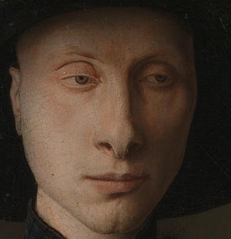
 Close up of the mans face. 

I am going to take idea 2 forward because I feel it would be more challenging and I would have a more sophisticated outcome as there is more detail and interesting aspects. such as colours, angles body positions and there is a more complexed background.

Over the holidays I am going to prepare my background and collect any necessary materials or object needed.
Shopping list 
Head piece - Claire's £5.00

Models 
Claire Edmundson - elf lady
Milly Reeves - Man

Scene - down stairs in the studio, so I can use the lightening facility.
The photos
These were my photos that I used to create my final outcome. I was experimenting with light and body positions to try and get the best results I could.


Photoshop
1. Firstly I chose the best images then I opened three layers and used ctrl v to paste them in.  Before I could do anything I had to get rid of the padlock on the background photo so I could make changes.
2. I used the levels tool to change the colour to try and match the original image of the people.
3. I used the quick selection tool  and magnetic lasso to cut out my people and get rid of any excess.  While I was doing this I also used the refine  edge button (select - refine edge) to clean up the outline. I then used the clone tool to add pieces in that it cut out by accident like hair as this is thin selections.
4. When it got to editing myself (the lady) due to the similar tone I had to change the tolerance when I got round to the dress and the grey background. After that I had to use the magnetic lasso and carefully make sure all of my body was in. During this I used the zoom in (ctrl =) and zoom out tool(ctrl -). 
5. To make my self look pregnant I was going to use a cushion but because my  dress is tightly fitted I used the liquefy tool on Photoshop. (Filters - Distort - Liquefy) 
6.When placing my people in to position I was finding the background too small so I used the clone tool to make it bigger and made the canvas bigger.
7. I also made my arm shorter to make the hand position work. To do this I used the quick selection to cut part of my arm off. Then I used the free select tool + shift ( to keep the aspect ratio) to place my hand back in place.
8. I used the the spot human brush to fill in the man's coat and the clone tool to get rid of the t-shirt as I decided i didn't want it to be seen.
8.Finally I used the merged layers to combined the 3 images together because I found that having them as separate layers made the image look separated.
9. I altered the colour saturation and because the photos were one it changed everything.

Issues I had
During the process of 'cleaning up' my photos and merging them into one outcome I was finding that because my background drawing was a drawing and the people were photographs the people looked very sharp and out of place. I then took a experimental approach and used some of the artistic effects and filters to alter my photo.

The experimental photos 

Normal. 
This picture there is limited filters. I felt that the people look to sharp and it doesn't look natural.I like this because the colours are strong.


Canvas with white border 
Personally on Photoshop I felt this simple white border finished the picture of and gave it a finished look.


Antique effect with canvas and border.
I liked this black and white effect because I think it makes the photo old looking so is suitable for when the picture was set in the renaissance times.


Final photo with limited filters


Canvas
I added this canvas filter and i felt it bleneded in perfectly because it softened the people and created an painting look which the original looks more like.


Evaluation 
Overall I am very pleased with my outcome considering the whole photoshoot has been an new experience. I fell that my outcome reflect the effort I have put in because I have thought about different aspects such as lighting, background and angles and not just used a phone to do a quick snap. Also from a fashion point of view I tried to included the ruffles/layers in the dress which were the style long dress were painted in the renaissance time. I think my background worked extremely well because I focused on shade and light. The colours work well compared to the original image because there is a large empathise on the blending in of the soft pastels. When editing on photoshop I was finding it difficult to have my people in similar positions due to the arms being long, so I had to edit them. Personally I like the bold colours and i think they do work well however becuase the background is a drawing and the people are photographs it does stand out massively. If I was to do this again I would plan my time better. Ideally I would have liked the make up students to create the sinister face of the man and even have created the elf  ears. We were given the opportunity but I never properly arranged it.Furthermore If I was given the change to do it again I would try and get the people and the background all in one shoot. This again was due to planning and time, if I did have just the one shot it would have made editing easier because everything would all be in place. I could have also focussed on more minor detail such as the hair and hand positioning if I had one photo.